Yespark
Brand Design, Motion Design, Brand StrategyYespark is a startup created in 2014. It allows private individuals and professionals to reserve parking spaces for short or long periods. It offers several subscription deals by the month, day or hour to reserve a parking space near your home or workplace for your car, motorcycle or bike. It also offers electric charging stations on some of its parking spaces.

Between 2019 and 2022, the company has doubled the number of employees and increased the number of parking spaces it manages to 60,000. Since 2021, Yespark has also been offering to install electric charging stations in some of its parking spaces.
These evolutions have required the brand's rules of practice to evolve, so that its discourse is consistent across its different communication channels (B2B, B2C and internal). It is equally essential that these rules of practice can be easily adopted by the company's new employees and its various collaborators.
Yespark's Branding Style Guide
I was asked to develop and updated version of the company's branding style guide. This work was carried out in collaboration with the product and brand strategy teams.
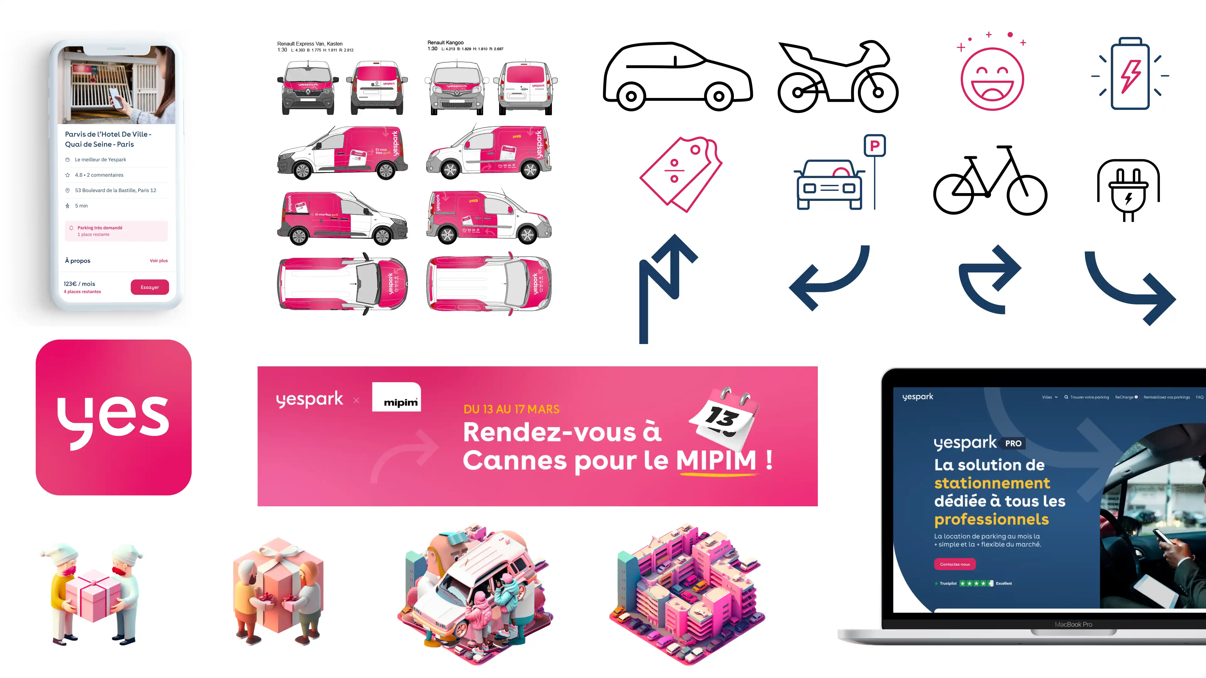
The previous guide, made in 2020, listed the very basic elements of the brand : colors, typography. Through the company’s recent expansion came a set of new products and their accompanying icons, pictograms, color combinations and illustrations that hadn’t been formally organized yet.
A list of all the elements of the brand in use (mobile app, website, social media, print and POS ads) had to be established. Then, we would have to determine how they are used and from that, derives the rules of proper usage. After that, it was necessary to determine how the different brand components fit with each other. Finally, we proceeded to a strict selection of the components to be included in the updated version of the brandbook.

The exchanges between the product and the brand design team mainly revolved around four major points. First, many redundancies were identified in the icons and pictograms in use. Sometimes the same idea was represented by two or three pictograms in different components of the brand. We made a selection based on the pictogram's relevancy to the function and its consistency with the rest of the set, notably regarding line weight and design style.

This work resulted in an expanded version of the style guide. We went from 6 categories to 12 and from 17 pages to 73. That version is more exhaustive and will allow for a better understanding of the brand's guidelines by the company's employees and collaborators.
Yespark's Social Media Video Ads

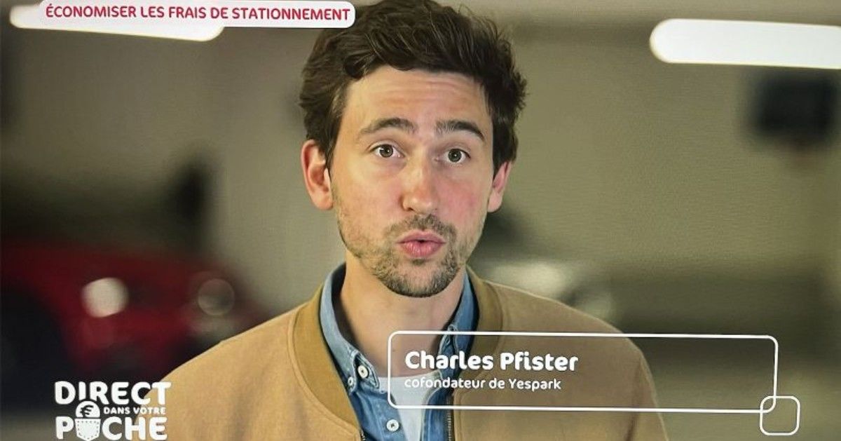
In June 2023, Yespark was invited to participate to "Direct dans votre poche" on French television channel M6, a show that shares the best money-saving tips for households in France during prime time. The show is watched by about 2.9 million people every night.
In order to take advantage of that report about the company core business, the marketing department decided to run a social media campaign to reinforce brand awareness and capitalize on that organic media coverage.
After concertation with the marketing department, we opted tu run pre-roll ads on YouTube and Facebook. That choice was driven by three main characteristic of pre-roll advertising: frequent exposure, cost effectiveness and broad reach.
The report was about how convenient Yespark’s parking solution is for its users, whether they have an unused parking spot to rent or are looking for a parking spot in their neighborhood. Our ad campaign would then focus on that aspect: with Yespark, it’s easy to find a parking space in the city. We needed an ad for each of the three main categories of vehicles we advertise parking places for: cars, motorcycles, and bikes.
We decided to use excerpts from Yespark’s recent video campaign, “Prenez la vie côté yesss!”. Given the brief duration of the pre-roll videos (6 and 10 seconds), it made sense to use the punchlines from these 30-second ads and pair them with calls to action and unique selling propositions.

We ran multiple taglines, looking for the perfect mixture of concision and effectiveness. It was important to see how each of these taglines would work in situation, so we ran multiple renders of the animated text with the selected taglines and different CTAs and USPs. That process that could quickly become tedious and overwhelming was made easier by using Cavalry as the motion desing software of choice. Using a Google Sheets document connected to our Cavalry document’s text input, we were capable to produce a great number of ads iterations with very little friction between the brand design and marketing team.

When a word had to be replaced or a typo corrected, all the copywriter needed to do was modify the text in the connected Google Sheets document, and the change would take effect within the design immediately.
At the end of the process and after final review by the marketing department, we had a total of twelve ads : 6x10s and 6x6s videos, four variant for each of the mode of transportation mentioned in the ads (car, bike, motorcycle).
Other Brand Content
To better represent the company's latest evolutions, Yespark needed to revise their email signatures.
The goal was to produce lightweight animations in two different versions : one supply and one demand, depending of the department the employee is working for.


